← All work
Email StrategyModular Design SystemCreative Ops

Fetch Email,
Rebuilt

When I started, a Fetch email was a hero image and a wall of text that read like a Word doc. I turned email into a real marketing channel, then built the monthly habit that kept it getting better.

ClientFetch
My roleEmail creative strategy and design
ChannelsEmail, push, in-app
Years2021–2025

The challenge

Every email followed the same recipe: design one hero image with a headline, make a tall version for mobile and a wide one for desktop, then paste the rest of the message in as live text. There were no email best practices in place, one link per send, and nothing that treated email as a channel worth investing in.

Before
Hero image + headline
(made twice: tall and wide)
one link
a flyer and a Word doc
After
Hero + CTACTAOffer module · image + CTACTAOffer carousel · 3 cards, 3 linksCTAGame / feature moduleCTAReferral moduleCTA
a story, built from modules

What I brought in

Email marketing best practices that weren't in place, turned into a system the whole team could build with.

01Modular templatesA library of interchangeable modules, so every send is assembled, not designed from scratch.
02Editorialized storytellingEmails that read like content, with a narrative from header to footer instead of a flyer and a wall of text.
03Visuals through the bodyImagery carries the story all the way down, not just in the hero.
04Many ways to clickEvery module links somewhere, so one email can drive to several offers and features.
05Scannable, mobile-first layoutsF-pattern friendly structure and clear hierarchy for people reading on their phones.
06Mix and match to stay freshSwappable versions of each module, so people who get the same flow repeatedly don't see the same email twice.

The system at work

Welcome series, card launches, seasonal campaigns, partner takeovers and shopping moments, all from the same modular kit.
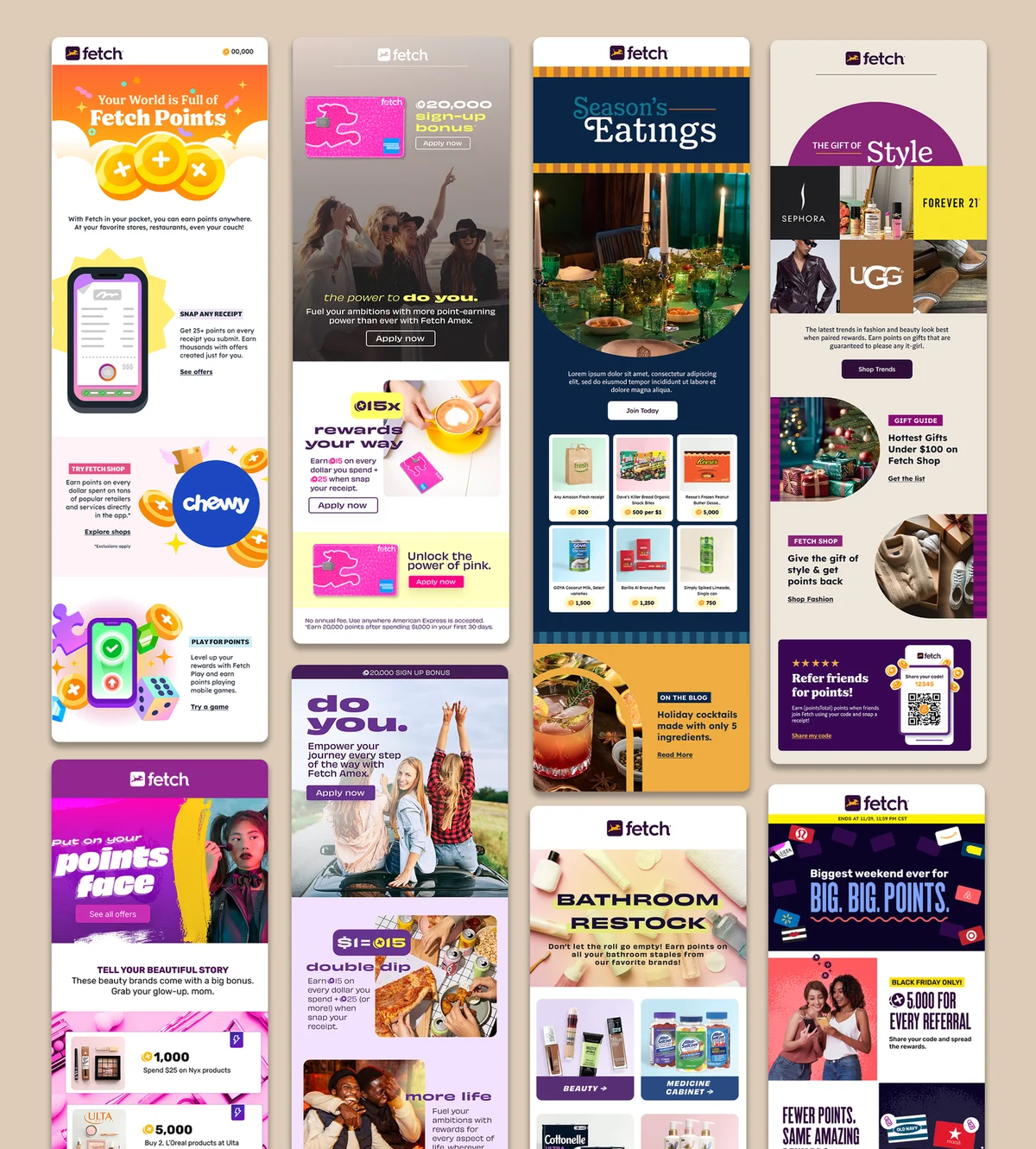
Eleven Fetch emails built from the modular system
+600% lift in email engagement once the modular system launched.
The operating rhythm

The monthly Creative Recap

Every month I led a session reviewing everything we sent across email and other comms: what performed, what we learned, and what we'd change. It followed the same five-part path every time, moving the team from evidence to action.
01StandoutsWhat worked, and what creative choices helped it work?
02Content analysisWhat patterns or friction showed up across the work?
03Competitive landscapeWhat outside ideas could expand our playbook?
04Audience insightsWhat human behavior should change our approach?
05Creative strategiesWhat will we keep, improve or test next month?
Creative Recap cover, April 2024 Creative Recap cover, June 2024 Creative Recap cover, October 2024 Creative Recap cover, November 2024 Creative Recap cover, January 2025

What came out of it

A few of the changes that started as a recap takeaway and became part of the system.

Mix and matchSpotted people receiving the same flow several times in a short window. The fix: interchangeable versions of every module, which also opened up new testing.
Carousel restructureRebuilt the offer carousel with a clear anatomy (eyebrow, headline, subhead, icon) so it was easier to scan and consistent everywhere it ran.
Onboarding refreshReworked new-user comms around value first: why points matter, then how to earn them, then what to do next.