The challenge
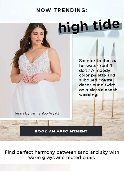
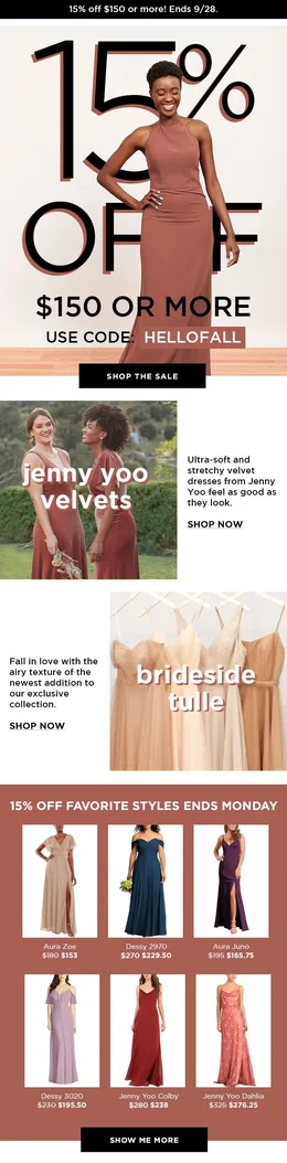
Brideside had loose brand guidelines: a logo, typefaces and one brand blue. With three expressions of the brand (Brideside, the Poppy sub-brand and the Brideside BRIDE bridal line), weekly sends and always-on paid social, there was nothing to keep the creative consistent or fast to produce.
The signature devices
A small kit of repeatable moves. Any designer could combine them and still land on-brand.

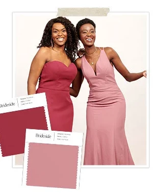
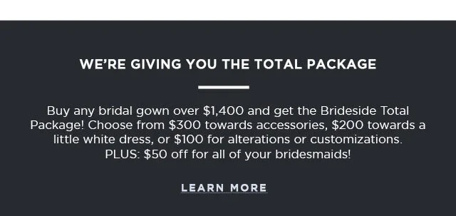
Built from modules
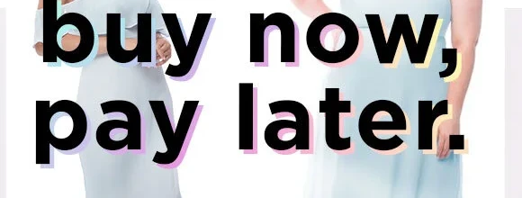
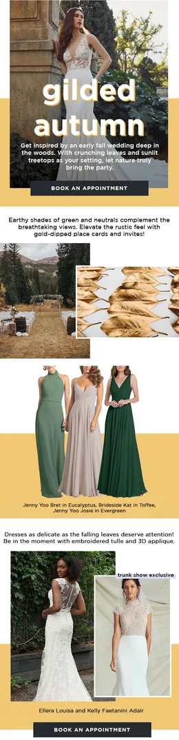
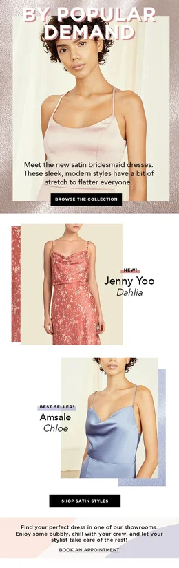
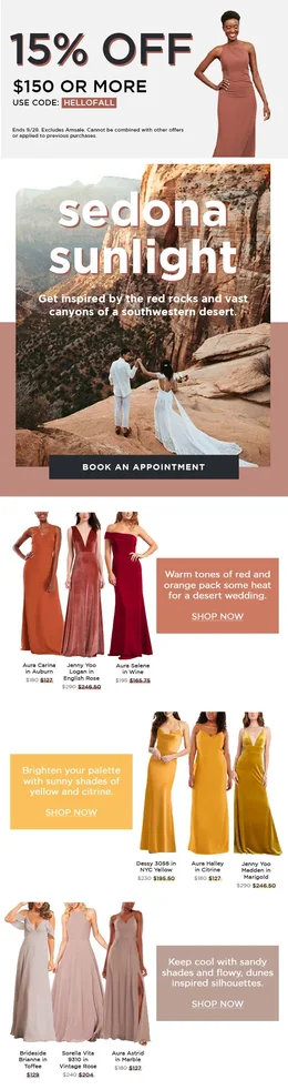
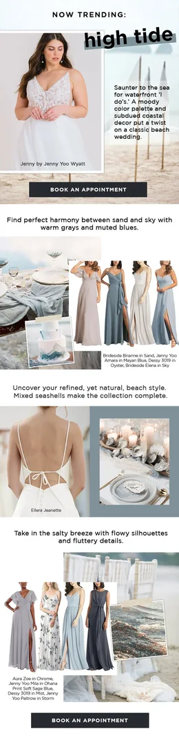
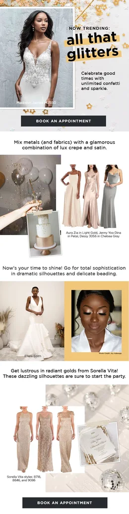
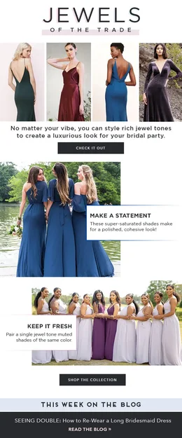
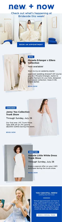
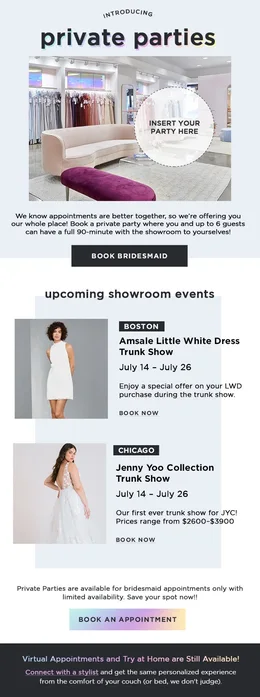
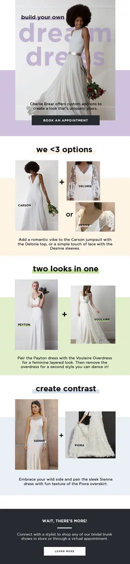
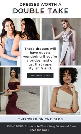
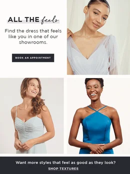
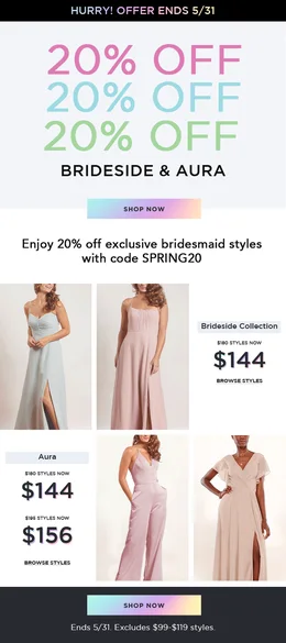
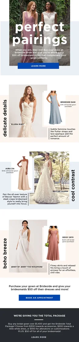
Every email was assembled from the same parts, so a new campaign meant new content, not a new design.
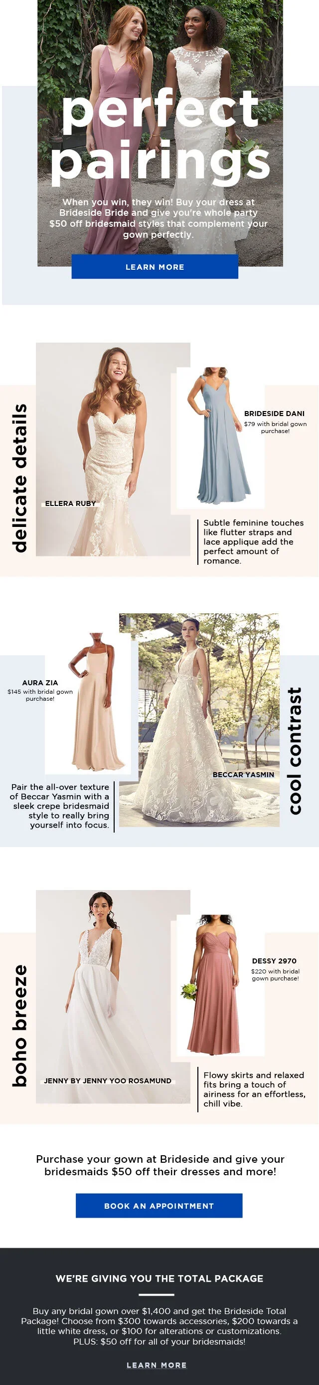
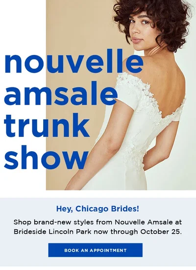
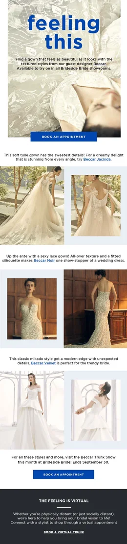
- HeroA full-bleed image, the headline in the brand type, one clear call to action.
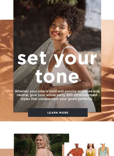
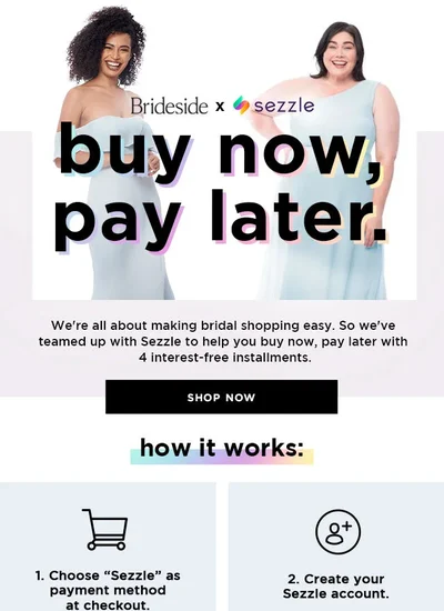
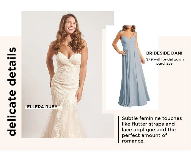
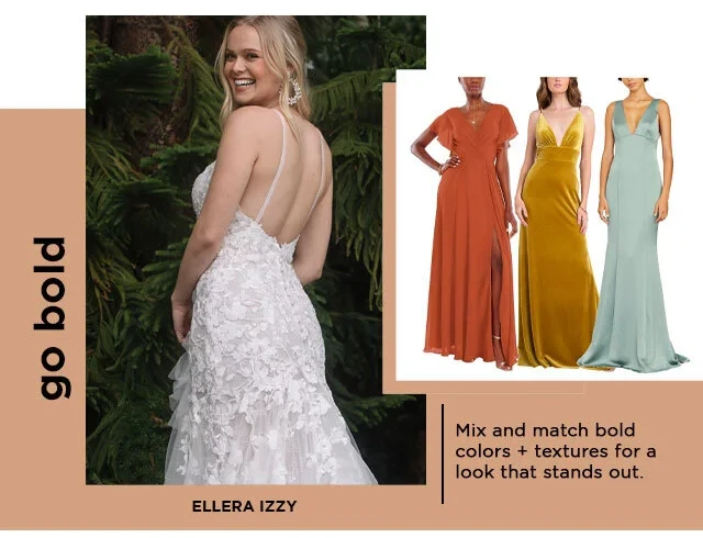
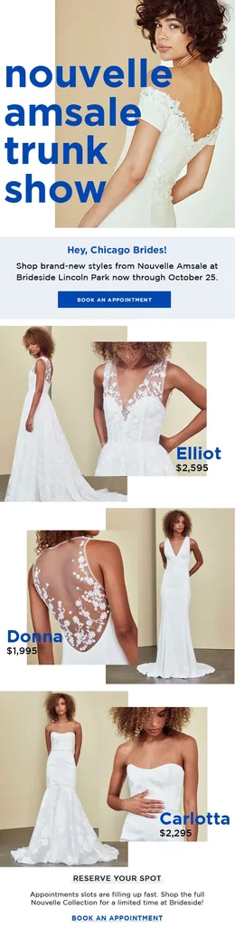
- Pairing moduleGown + bridesmaid, a sideways label, offset color blocks and product tags. Built to swap in any two products.
- Mirrored moduleThe same module flipped, so a long email keeps its rhythm without repeating itself.
- Mid-email CTAA reminder of the offer before the close.
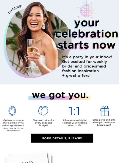
- Total Package footerThe standing offer, in the same dark module every time.
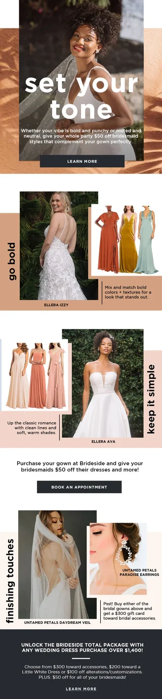
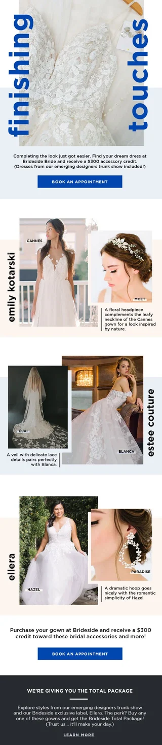
One system, every send

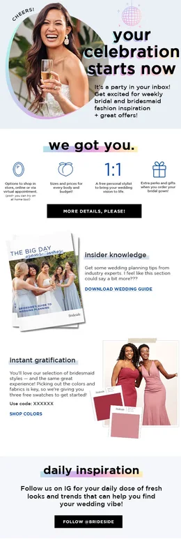
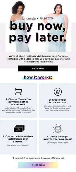
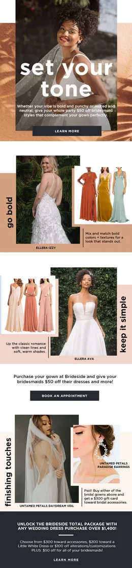
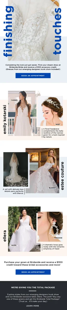
Beyond email
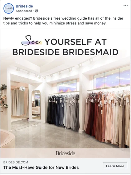
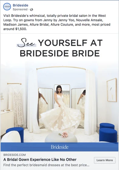
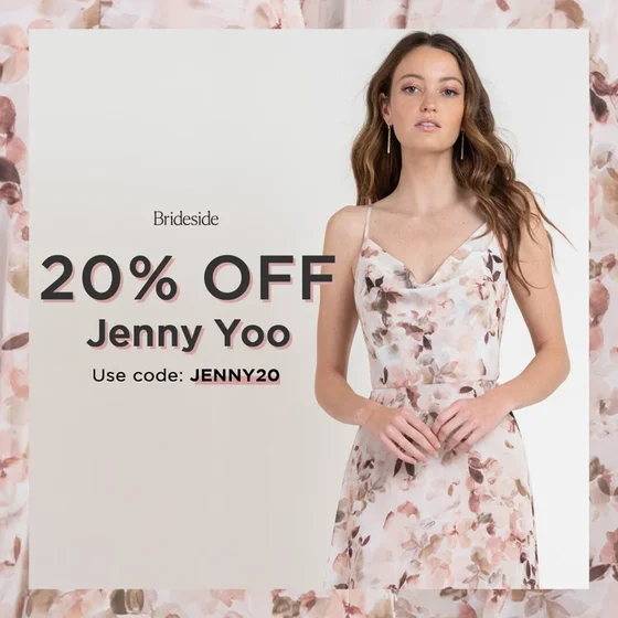
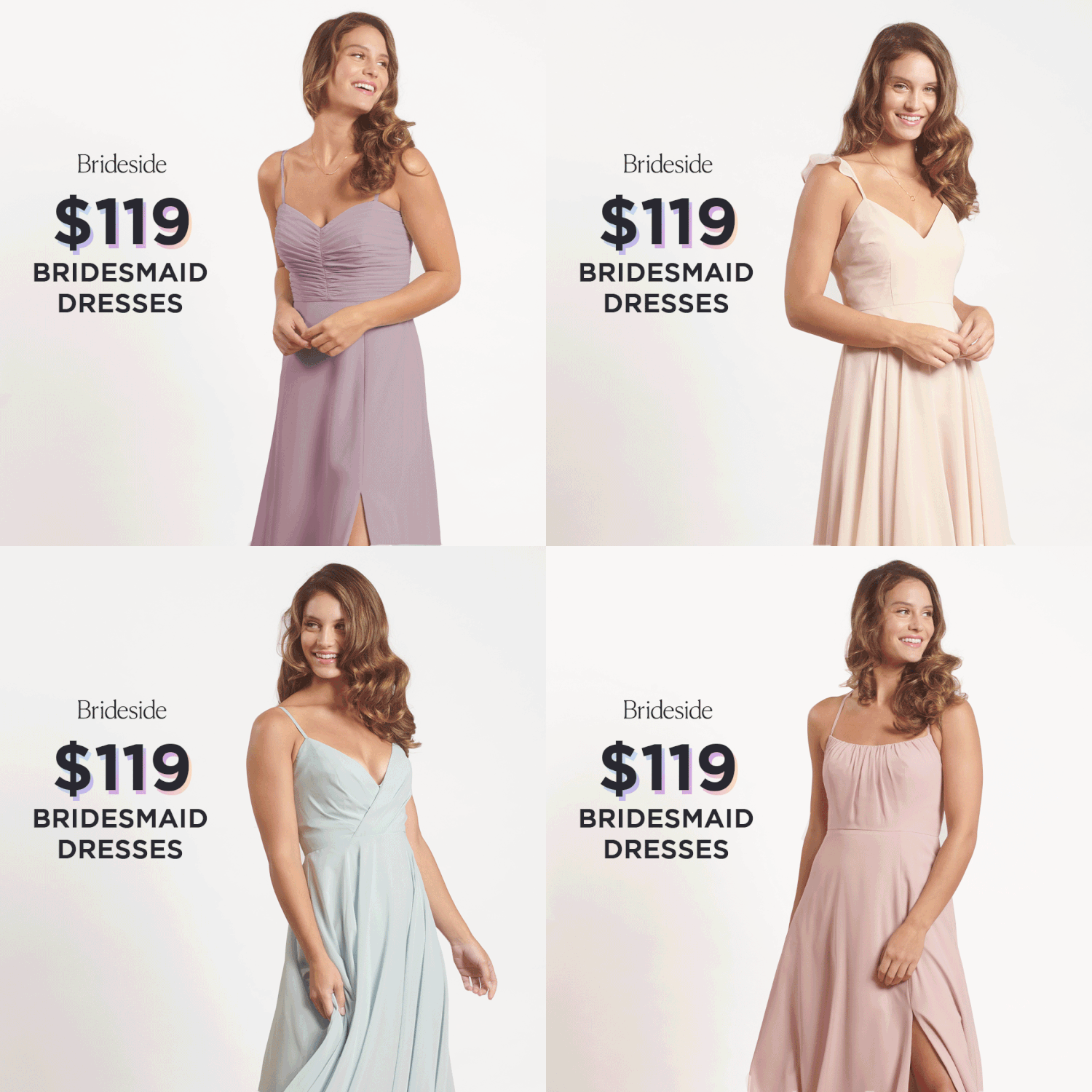
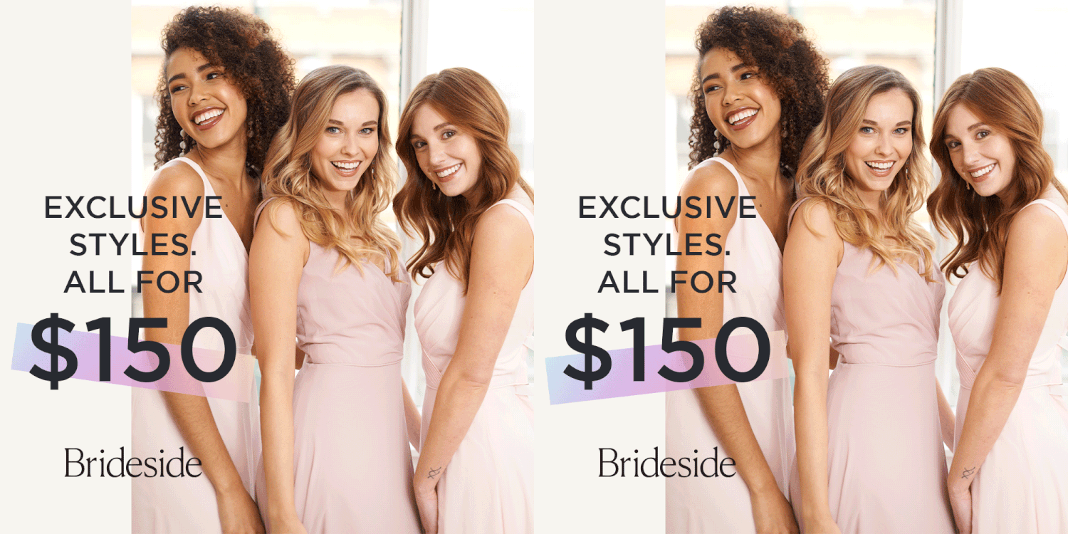
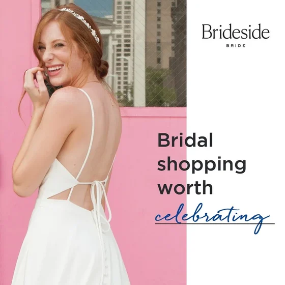
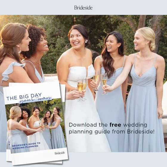
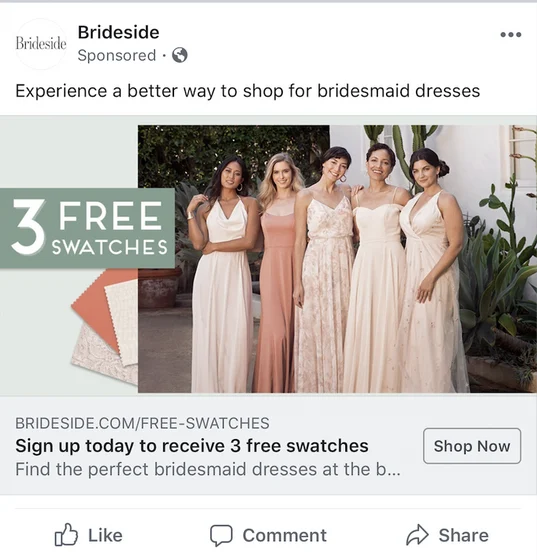
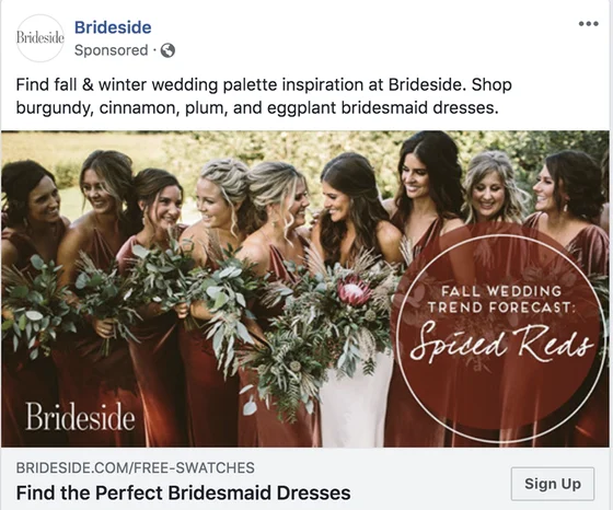
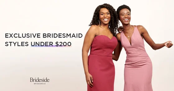
The system carried onto Facebook, Instagram and Pinterest. One "See yourself at" template served both the bridesmaid and bridal businesses with a simple color swap.
Creative as research
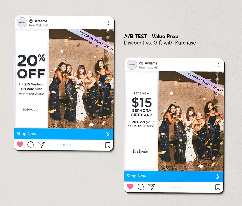
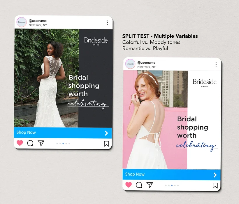
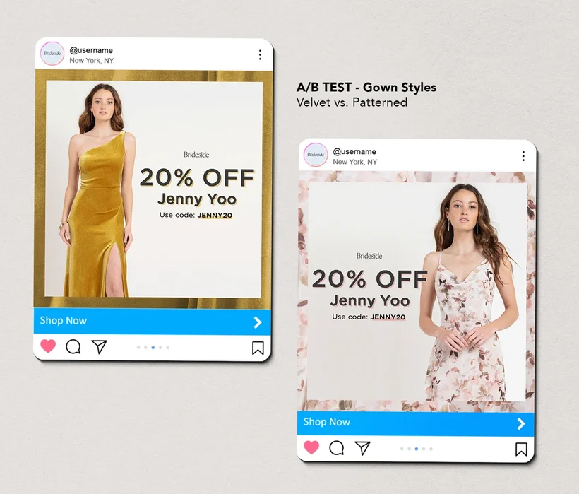
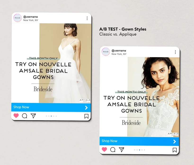
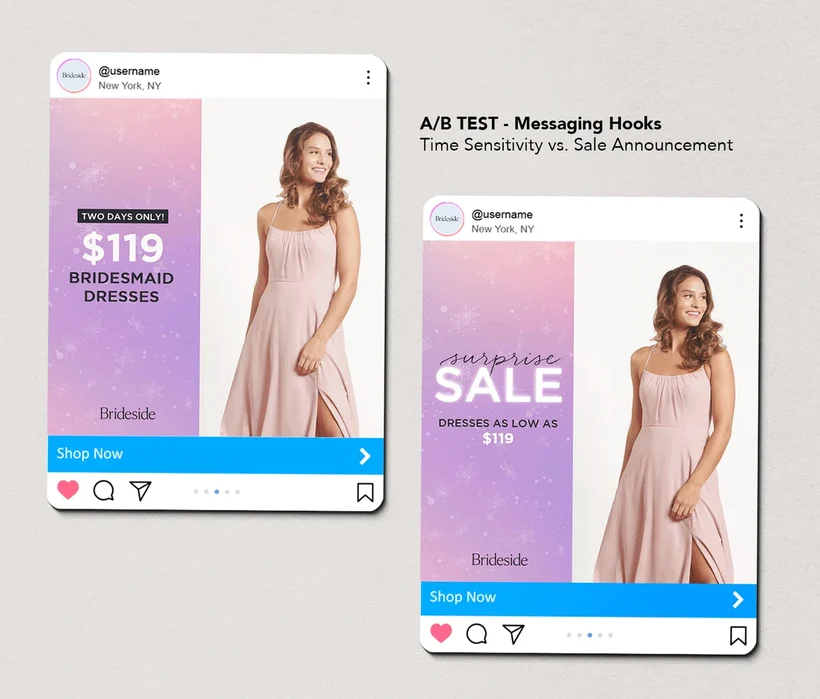
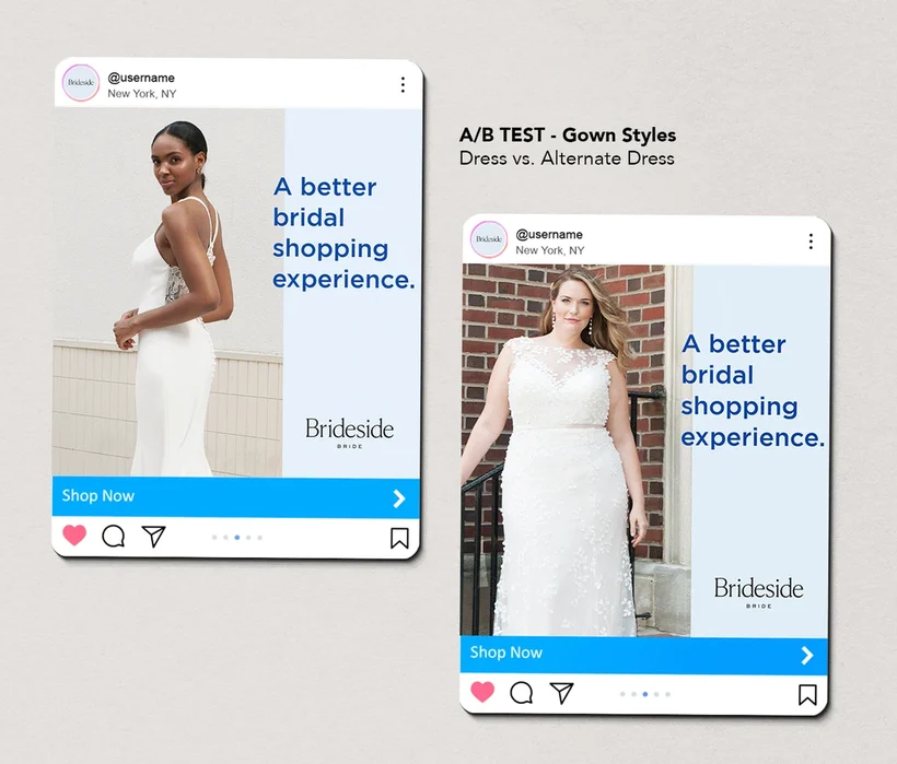
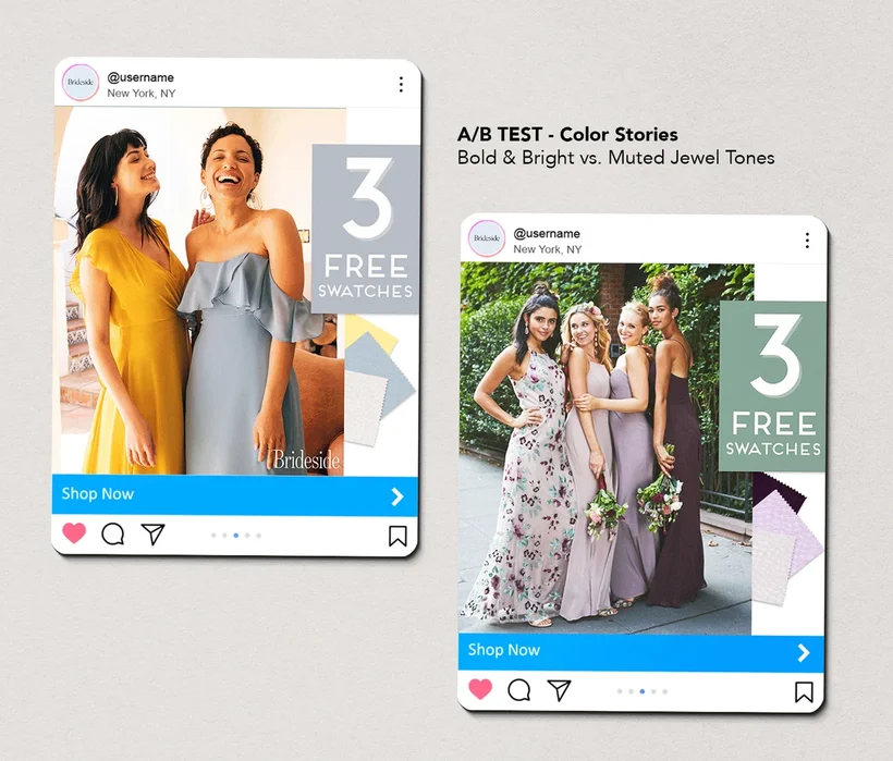
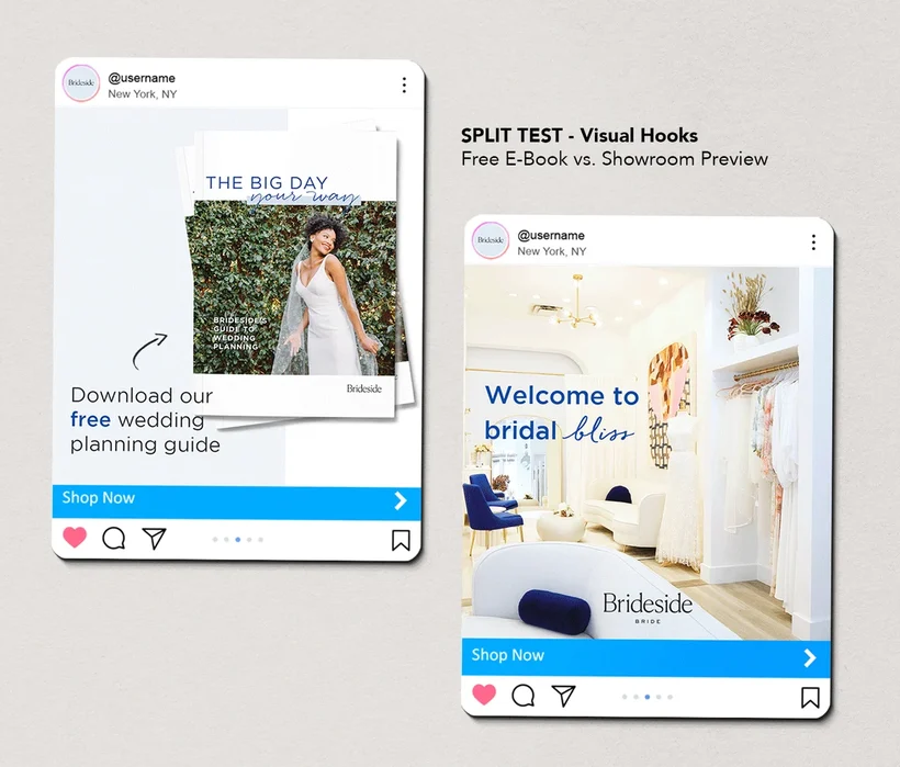
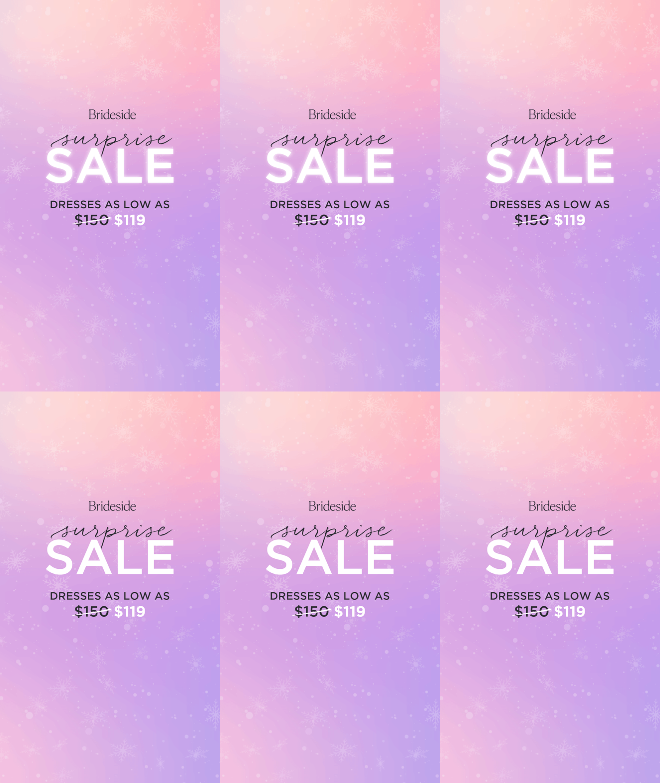
Paid social was as much a research tool as a performance channel. Because the system held everything else constant, each test isolated one variable, from the offer and the hook to the color story and the gown in the photo.
The insights shaped more than the ads. They informed how we understood the Brideside customer and what she responded to, emotionally and aesthetically.
Brides and bridesmaids buy for different reasons. The value props that moved one audience didn't always move the other.
Taste has a map and an age. Affinities for certain styles and designers shifted by region and age, so we could match the right products to the right audiences.